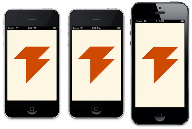
iPhone 5 web app startup image

I wrote about icons and startup images for iOS web apps a while ago. Apple just released the iPhone 5, which is taller than previous iPhones. Fortunately it’s a piece of cake to add iPhone 5-compatible startup images to a web app.
Unlike native apps, web apps aren’t letterboxed. That means old startup images won’t work because they’re the wrong resolution. The iPhone 5 still requests them but it just shows a blank white page on launch.
So what is the correct resolution? The iPhone 5’s screen is 1136
pixels tall and the status bar takes up 40 pixels on retina devices.
That means 640x1096 is the right resolution.
To match the iPhone 5 with media queries, use the reported device
resolution of 320x568. It also has a -webkit-device-pixel-ratio
of 2, just like all other retina devices.
<link rel="apple-touch-startup-image"
      media="(device-width: 320px)
         and (device-height: 568px)
         and (-webkit-device-pixel-ratio: 2)"
      href="apple-touch-startup-image-640x1096.png">
Complete Example
I’ve created a minimal web app that includes all icons and startup images for iOS devices. It’s also available a Gist. Please let me know if you notice any problems or want to suggest an improvement.
Notes
I made the media queries overly specific to avoid the problem of
iPhone 5s downloading images and then discarding them. It’s possible
to make the media queries a little simpler by only specifying the
device-height, but I don’t think that optimization is worth it.
Web apps can be letterboxed, but only if their viewport’s width is
set to either device-width or 320. To set the proper scale and
avoid letterboxing, set the viewport’s initial scale to 1.0.
(Thanks to Max Firtman for this solution.)
<!-- Letterboxed on iPhone 5 -->
<meta name="viewport"
      content="width=device-width">
<meta name="viewport"
      content="width=320">
<!-- Not letterboxed on iPhone 5 -->
<meta name="viewport"
      content="initial-scale=1.0">
<meta name="viewport"
      content="width=320.1">