Dropdown menu in Twitter Bootstrap's collapsed navbar
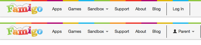
A few weeks ago, I rebuilt Famigo’s website with the Twitter Bootstrap. Overall, we are very happy with the results. We noticed a little problem, though: our login link and user dropdown got lost in the shuffle.
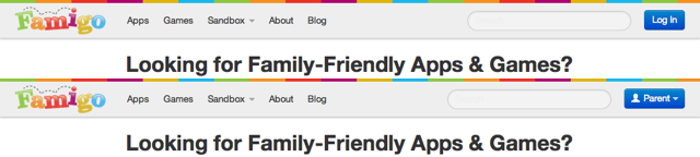
You may think finding the login link on that page is pretty bad. Well, you ain’t seen nothin’ yet. This is what our home page looked like on a mobile device:

Can you figure out how to log in on that page? Most of our users couldn’t either. (Hint: click on the triple bar icon in the top right, then click “Log in”.) Since about 70% of our visits come from mobile browsers, its important to make it easy for them to log in.
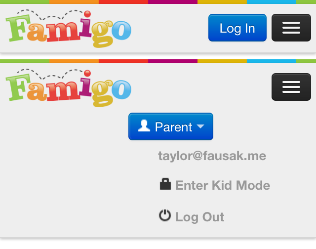
So I did the obvious: I made the link into a colorful, always-visible button nestled in the right side of the navbar. I did the same thing for the user dropdown.
That was good, but there was a problem: the dropdown automatically
expanded when the viewport got too narrow. Normally, this is a good
thing. It allows you to put dropdowns in your navbar and have them
collapse nicely. I didn’t want them to collapse, though, and moving them
out of the nav-collapse element didn’t work.
I scoured the documentation for a way to prevent dropdowns in navbars from collapsing. No luck. Then I turned to the issue tracker to see if anyone had filed a bug. No luck. Then I looked on Stack Overflow for someone trying to do this. No luck. Finally, I decided I’d have to roll my own solution.
After poking around WebKit’s inspector and the bootstrap source, I found three ways to do this:
- Add a data attribute to the dropdown to fix the responsive selectors.
- Replace the dropdown’s class to rebuild its styles from the ground up.
- Add another class to the dropdown to override the responsive styles.
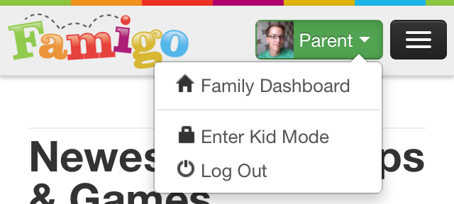
Before I get into these implementations, this is how they’ll look when they’re done:
Adding a Data Attribute
This method requires changing the least code. When creating a
dropdown menu in a navbar, just add data-no-collapse="true" to the
dropdown-menu element. For instance:
<ul class="dropdown-menu">
<!-- becomes -->
<ul class="dropdown-menu" data-no-collapse="true">
Then change nine lines in bootstrap-responsive.css that refer
to dropdown-menu. Add :not([data-no-collapse="true"]) to the
dropdown-menu selectors. For example:
.navbar .dropdown-menu { /* ... */ }
/* becomes */
.navbar .dropdown-menu:not([data-no-collapse="true"]) { /* ... */ }
This approach is the cleanest in that the least code is changed and it’s
pretty easy to keep it up-to-date if the bootstrap changes. However,
there are a couple caveats. The [attr] selector isn’t supported by
IE6, and the :not() selector isn’t supported by IE8.
Ultimately, I used this approach for Famigo since all versions of Internet Explorer account for less than 3% of our visits.
Replacing the Class
This method requires changing a little more code, but it doesn’t use any
fancy CSS selectors. Instead of adding a data attribute, just change the
class from dropdown-menu to dropdown-menu-no-collapse. For example:
<ul class="dropdown-menu">
<!-- becomes -->
<ul class="dropdown-menu-no-collapse">
Then change all the lines in bootstrap.css that refer to
dropdown-menu. Copy the entire selector, then replace the second
instance of dropdown-menu with dropdown-menu-no-collapse. For instance:
.navbar .dropdown-menu { /* ... */ }
/* becomes */
.navbar .dropdown-menu, .navbar .dropdown-menu-no-collapse { /* ... */ }
This approach is a little less clean than the first, but works in more browsers. If supporting Internet Explorer is important for you, this is probably the way to go.
Adding Another Class
This is the only method that doesn’t require changing any of the
bootstrap CSS. To get started with it, add the no-collapse class to any
dropdown-menu that shouldn’t collapse.
<ul class="dropdown-menu">
<!-- becomes -->
<ul class="dropdown-menu no-collapse">
Now, the hard part. Either in a separate CSS file that gets loaded after
bootstrap-responsive.css or inline CSS, manually override all the
responsive dropdown styles. I created a Gist that shows everything
needed. Here’s a snippet:
@media (max-width: 979px) {
    .navbar .dropdown-menu.no-collapse {
        background-color: #ffffff;
        border-color: rgba(0, 0, 0, 0.2);
        border-radius: 4px;
        border-style: solid;
        border-width: 1px;
        box-shadow: 0 5px 10px rgba(0, 0, 0, 0.2);
        display: none;
        float: left;
        margin: 0;
        padding: 4px 0;
        position: absolute;
        top: 100%;
    }
    /* ... */
}
As you can see, it’s a bit ungainly. And it’s very brittle — any change to the bootstrap means you’ll have to go back and make sure all these values are correct. You should only use this method if you can’t (or don’t want to) modify the bootstrap’s CSS files.